Data Visualisation
There has been a lot of discussion about how large language models could potentially replace many white-collar jobs. OpenAI recently released a beta version of its Code Interpreter with little fanfare. However, as a data scientist, the features appear to be a significant development.
A critical component of successful interactive visualizations is orienting the users towards what you want them to look at.
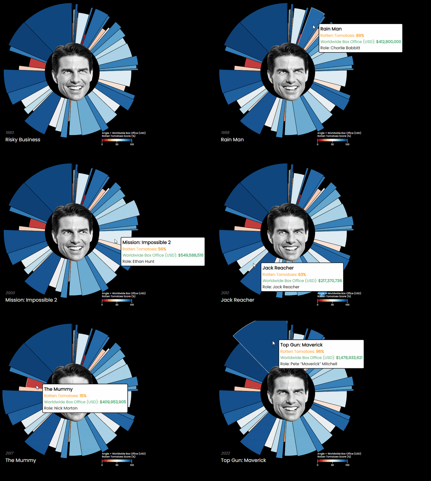
In my original post I used Tableau to build the visualisation showing the relationship between critic scores and the box office performance of Nicolas Cage’s films. For the latest update, I wanted to use D3.js, particularly for the d3.arc() and d3.pie() functions that make building the chart slices simple and scalable.
My main tools for drawing data visualisations in the past few years have been Tableau, then PowerBI, then matplotlib and Dash. All are very capable tools, but D3.js has always been the holy grail for interactivity, animations and overall flexibility.
To demonstrate the concept of network analysis, I built an interactive, force-directed graph of character relationships for each of George R.R Martin's Game of Thrones novels using D3.js and Tableau.
Data Engineering
In the previous posts, we looked at loading all of the 1.2 TB of pageviews data from Wikipedia, and ranking the most popular people by day. The final step involves bringing all the data together into a visualisation.
Can we find the most viewed people on Wikipedia each day in 2020 and get a picture of each one?
This year, the English language Wikipedia has averaged around 8 billion page views per month, making it one of the most visited websites in the world. The first half of 2020 has been incredibly eventful, and I was interested building a dataset to see exactly which pages Wikipedia users have been most interested in.
Machine Learning
Some consider XGBoost something of a data science ‘black box’. The models are not quite as easy to interpret as a decision tree, or a set of manually coded rules. The aim of this post is to demystify XGBoost, and give a mostly ‘maths-free’ explanation of how it works.
Uplift modelling is a powerful, but relatively unknown technique in large organisations. How can businesses use data science and machine learning to market to the right customers?
Risk Modelling
Quantitative cyber risk modelling unlocks a whole new class of decision making for a C-level executive
Natural Language Processing
Very often I come across business problems where a large amount of natural language data needs to be processed and analysed. One good starting point for those problems is to build a topic model.


