Learning D3.js
D3.js has produced some of the most spectacular data visualisations I have ever seen on the web.
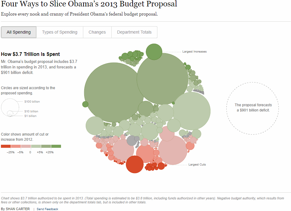
Source: The New York Times
My main tools for drawing data visualisations in the past few years have been Tableau, then PowerBI, then matplotlib and Dash. All are very capable tools, but D3.js has always been the holy grail for interactivity, animations and overall flexibility. Tools like Tableau lock you into to their pre-built data visualisations. While you can often work out hacks to produce non-conventional charts like (see my Nicolas Cage Film Career post), the workarounds are difficult to follow, and prone to breaking when the tool gets an update.
I recently finished reading Show Your Work! by Austin Kleon. One of the main messages of the book was that beginners are often better than experts at explaining things. It’s often said that D3.js has a very steep initial learning curve, which can put some people off. I thought I'd document my progress learning to use the library, and highlight concepts that I found particularly tricky. I also want to put together a D3.js portfolio on GitHub pages to use as a reference for building future data visualisations. This won't be an exhaustive tutorial. Instead I wanted to highlight the confusing points I came across when learning D3, and provide links to some good explanations and books.
So is D3.js a charting library?
The d3js.org site describes the library as:
D3.js is a JavaScript library for manipulating documents based on data. D3 helps you bring data to life using HTML, SVG, and CSS. D3’s emphasis on web standards gives you the full capabilities of modern browsers without tying yourself to a proprietary framework, combining powerful visualization components and a data-driven approach to DOM manipulation.
At first, I thought that describing the library as 'manipulating documents based on data' was deliberately obtuse - isn't it just a library that lets you build charts? But the more I read about the Document Object Model (DOM), the more I understood what the statement actually meant. The DOM is an interface that treats an HTML document as having a tree structure, where each node is an object on the page. A central tenet of D3 is to make data visualisation easier without introducing a new way of representing an image.
D3's main task of visualisation is to construct a DOM from data. It also must update the DOM when the data changes, either from the data changing in real time, or through user interaction. In a D3 visualisation, each data point can have a corresponding graphical mark. D3 helps us maintain the mapping from data to graphical elements.
The graphical elements are SVGs or Scalable Vector Graphics. SVGs let us build shapes on web pages with code. A D3 chart is a set of SVGs combined together. SVGs are useful because they can scale infinitely, which is important for making good-looking charts for any screen size.
Let's build a bar chart
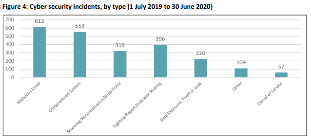
A good first start to show some of the features of D3.js is a bar chart. It's a simple display of data, but we can add a bunch of really nice features with D3. The ACSC Annual Cyber Threat Report 2019-2020 provides a chart with the most common types of cyber incidents in Australia, from July 2019 to June 2020. It's pretty difficult to read, and has a lot of white space, so let's see if we make it better.
What files do we need for a D3 chart?
index.html/styles.css/cyber_incidents.csv
We first need to define a very simple webpage for our bar chart to live on.
The HTML page is defining the elements of our page, and providing links to other files. The stylesheet links to our CSS file that specifies styles on the elements, such as colours, sizes and positions. In our CSS file, we just specify the font.
The link to Google Fonts provides the stylesheet with the font we want to use on our chart. This isn't strictly necessary for all charts, but it's very nice to have when we want a consistent style across reports or webpages.
The title references the title that will show in the tab of the browser.
The div id links to the barWrapper element we will create in our JavaScript file.
Finally, the last two script src lines link to the D3 library (the latest v6 in our case) and where we have saved our JavaScript file containing our D3 code.
Learning D3 without knowing the basics of HTML is difficult. Before trying to make a D3 chart, I would go through a book like HTML and CSS Design and Build Websites or complete the w3schools HTML Tutorials. I tried to skip this step when starting out, because basic HTML is fairly intuitive to read. HTML and web pages do get more complex when adding elements around a D3 visualisation. It’s worth building a solid foundation of HTML knowledge first.
Our data is stored in a 2 column CSV, cyber_incidents.csv.
draw-bars.js
I've split the elements of the bar chart code up to demonstrate some important concepts of D3 charts. First, we'll start with the data loading.
Load and access the data
The inclusion of .then(function(data) { was something that confused me when looking D3 examples. From D3 v5 onwards, the fetch API is used, which means that d3.csv now returns a promise. Promises are explained well in this article by Kevin Kim. For our purposes, we just need to include .then() after d3.csv() to make sure our data is loaded before we start drawing the chart.
The next step is to access the data, and specify the type. Setting 'Accessor functions' was something that was suggested in Fullstack D3 and Data Visualisation by Amelia Wattenberger. The accessor functions convert the raw data from the CSV into the metrics we're interested in. It's useful to create a separate function to read the values from the data for the following reasons:
One place to make changes: I've read through plenty of D3 examples where code to access the data (e.g. d.incident) is specified at every point where it's required, like the axis and data labels. If we want to change our chart to reference a different column, we would need to change all of those references in the code. With an accessor function, we only need to change one line of code.
Documentation: A reference to the original data used is very useful when going back and checking exactly what data the chart is plotting.
The parameter given to the accessor, d, represents a single row, or datum. Within the accessor function, d has properties corresponding to the names of the data columns in the CSV, which are incident and frequency in our data. We want to manipulate the values before returning the output. For the xAccessor value, we want to assign the property of the output object to be +d.frequency, where the + converts it to a number.
Create the chart dimensions
Next, we set the width and height of our chart. We also want to specify the margins, which will give us a gap between the chart bounds (the bit with the bars) and the chart wrapper containing the axis and other elements (more on this below).
Draw the chart canvas
To add elements to our chart, we need an existing element to append to. The barWrapper element is already specified in the HTML. The d3-selection module lets us select from and modify the DOM. In this case, we're specifying the element with the div id barWrapper. The hash symbol (#) is included to tell d3 to look for a div ID, rather than a div class.
The next step is to use the .append() method to add a new SVG element to our barWrapper element and specify exactly what size we want the SVG to be.
With the size specified, we now want the chart to fall within the margin bounds we specified. The .append('g') method creates a grouping of all SVG objects within barWrapper - sort of like a <div> for an SVG. The chart can be drawn in the <g> element then shifted all together with a CSS transform property. The .style() method does exactly that. We give a key-value pair to the style() method with "transform" as the first argument and "translate" as the second, specifying a translation along the x and y axis by the number of pixels in the margin values.
Create the chart axes
In most data visualisations, the scale and axes of the chart are defined by the data. We want to be able to feed in the data to influence the range of values on our axes.
We want to make a bar chart, which means one categorical axis and one continuous axis.
Scale functions take .domain() and .range() methods to define the domain of data that the scale covers, and the pixel range plotted on the chart.
d3.scaleBand() is used for our bar chart, as we have a categorical variable on the y-axis. The domain is all incident types, which we specify with dataset.map(yAccessor).
d3.scaleLinear() is appropriate for the x-axis, as we are displaying the number of incidents that occurred.
The .nice() function transforms the scale start and end values to 'nice' round values. This is useful when we compute our scales automatically from real data, where the start and end values may not be round figures.
Our axis generator functions yAxisGenerator and xAxisGenerator call the d3.axis functions to specify where on the chart we want to plot our axes. Each axis object is scaled by the scale functions to fit inside the specified range, and to draw axis ticks over the given domain. On our x-axis, we included .ticks(10) to force the x-axis to plot 10 separate ticks.
Finally we get to the exciting part of D3 charts! The most important, and arguably most difficult to grasp line of code is the selection on the 'g' elements and the enter().append('g') that follows. To understand what's happening here, I've taken a quote from Scott Murray's tutorials:
With D3, we bind our data input values to elements in the DOM. Binding is like “attaching” or associating data to specific elements, so that later you can reference those values to apply mapping rules. Without the binding step, we have a bunch of data-less, un-mappable DOM elements. No one wants that.
We use D3's Selections to bind data to DOM elements. We're going to be plotting more than one bar, so we'll bind the each data point to a <g> SVG element like we did with the bounds variable.
This looks a bit weird, because we're selecting all "g" elements before they're created. But let's break down what's happening:
bounds - Finds the bounds object in the DOM and hands the reference to the next step in the chain
.selectAll("g") - Selects all g elements in the DOM. Since none exist yet, this step will return an empty selection.
.data(data) - Counts and parses the data values. We have 7 rows, so this step gets executed 7 times.
.enter() - This step creates the elements we want that are data-bound in the DOM. If we have more data values than DOM elements (0 g elements vs. 7 data values) then .enter() will create a new placeholder element to hand to the next step in the chain.
.append("g") - Here we're taking the placeholder selection created by .enter() and inserting "g" elements into the DOM.
If we inspect the DOM, we can see that D3 has created 7 new <g> elements for each data value.

Using console.log(barGroups) we can see the data has been bound to the elements!

Drawing the bars
Now the data is bound to the the barGroups, we can add our bar shapes. To add some visual interest, we can add an animation as the graph loads.
The first line is appending the rect SVG shape to each element in barGroups we defined earlier. We then set the attributes of those rectangles, or bars based on the data. Because our chart is a horizontal bar chart, the "y" attribute is defined by the yAccessor (type of incident). That value is fed into our yScale function, which specifies exactly where on the chart each categorical variable should be plotted.
The height of our bars is defined by our yScale function. The yScale is is a d3.scaleBand() scale, so we can access the calculated band width from that function.
The .transition() tells the browser that we want to animate the transition between a bar with 0 width, and a bar with a width equal to the value given by xScale(xAccessor(d)). This makes the bars 'grow' across the page when it is loaded.
Finally, we set the fill (colour) of our bars with the variable defined earlier. The colours are defined across a scale, with a domain between 0 and the highest frequency in the data set.
Adding labels
To make the chart even easier to read, we can add text labels to the ends of each of the bars:
The code here is very similar to the code we used to draw the bars. We access the incident names with yAccessor to specify which bar each label will correspond to.
The transition is defined in the same way as the bars, so they 'grow' together.
We access the values for the labels with our xAccessor. We add 5 pixels to x positioning for the label, so that there is a small gap between the label and the bar.
Drawing the axes
With our bars drawn and labels added, the final step is to draw the axes on the chart.
When we call our xAxisGenerator, it creates a lot of elements. To hold them together, and keep the DOM organised, we create a 'g' element. The .call() method executes the xAxisGenerator function and preserves the selection for further method chaining.
The position of the axis is given by the .style() method. Here, we're placing the x-axis on the y-position given by the dimensions.boundedHeight of our chart. This isn't the absolute height of our chart. That value is dimensions.Height. The bounds are defined by the margins we specified earlier, which we can modify to move the axis around. The last variable adds a label to the xAxis.
Displaying the chart
We now have four files:
index.html(the web page we draw our chart on)styles.css(the style elements of the web page - only font in our case)cyber_incidents.csv(the data)draw-bars.js(the JavaScript/D3 code defining the bar chart)
These files give us everything we need to draw the chart in the browser. To see the chart, we navigate to the folder where the files are saved, and run live-server in the command prompt. This runs a local development server that hosts the webpage index.html. Here's what the chart looks like:
Final thoughts
I found working through chart examples in Fullstack D3 and Data Visualisation by Amelia Wattenberger particularly helpful for learning D3 concepts. The examples in the book are clearly explained and well structured. Having never coded in JavaScript previously, some of the syntax was a bit confusing. If you're in the same position, I recommend reading the MDN page for JavaScript Basics. Personally I learn best by having a real project to work on (a bar chart in this case). Anything I didn't understand in the D3 code examples, I would make a note of and look up. Following on from this example, I plan to build a 'library' of D3 charts that can be referenced later and applied to new data.
Is D3 worth learning?
D3 definitely has a steep learning curve, particularly for someone with with no front-end web development background (like me). But being able to control every aspect of the design of a chart is invaluable. Sharing animated and interactive D3 charts is much easier than it is with Tableau or PowerBI. There are a myriad of hosting options for D3 charts, including the free GitHub Pages All your audience needs to see your charts is access to a web browser. I look forward to building more charts in D3.
All of the code in this example can be found on my GitHub.