Every James Bond vehicle, visualised
You can see the working version of the James Bond scroller here.
The full code for the post can be found on my Github.
Motivation
I’ve been experimenting with scrolling and interactive visualisations lately, both at work and on my own personal projects. I’m sure you’ve seen examples of scrolling data visualisations on news sites:
Bloomberg: Scientific Proof that Americans are Completely Addicted to Trucks
The New York Times: The Dawn Wall
Jim Vallandingham writes in his So You Want to Build a Scroller post that a critical component of successful interactive visualisations is orienting the users towards what you want them to look at. Scrolling visualisations give us a way to move our audience through discrete sections of content, while modifiying the visualisations next to the text to create a unified data driven story. Jim’s demo code for a scroller was adapted for this post.
The data
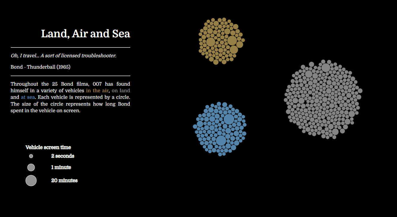
Nothan Yau of Flowing Data wrote about a visualisation he found that looked at The Vehicles of James Bond. The author, Koen Van den Eeckhout, had collected the data of every vehicle and how long it was in each Bond film. Koen’s visualisation was excellent, but I wanted to be able to drill-down and see the details of each individual vehicle. I emailed Koen and he kindly sent me the full dataset for my own use.
Using D3.js
The original format of the visualisation showed a static image of the time each vehicle was in the films. This was a good way to show a general overview of the vehicles, and a format that I replicated for my own charts. I liked how certain vehicles were highlighted with labels. I wanted to add that detail with a mouse-over event for every vehicle.

The next step was to divide up the circles to orient the viewer, and indicate the color coded difference between vehicle types.

One aspect I like about these ‘beeswarm’ visualisations is that a wide variety of pseudo chart types are possible while still maintaining the same nodes on the screen. Nodes can be stacked to form a kind of histogram, which is what I created in the next panel of the scroller.
Following the histogram, the nodes transform into a scatter chart, with with the vehicles that appear most often in the films plotted against their respective film’s release dates.

Finally, I wanted to split out all of the unique vehicle types, and label each one. Labels on every vehicle draw the viewer’s eye to some of the more unusual vehicles, like the jetpack in Thunderball (1965), or the cello case in The Living Daylights (1987).

There are limitations to the scroller data visualisation format. It’s a lot more work to get the page to work on all devices (particularly phones) and the chart tends to work best on large screens. Another issue is that the user needs to scroll to reveal the rest of the charts, which is not always immediately obvious. But sometimes, a scroller visualisation can be a very effective approach, particular when presented live to an audience. I received good feedback from a work presentation I gave using the same approach. The advantage was that I had total control over the scrolling, so the audience could just watch and take in the changing visuals. Using a novel approach can really grab the audience’s attention, which is an often overlooked but very important part of the visual communication of data.